Bars

Navigation items have been meticulously designed to be very straightforward, semantic, and dependent on sensible defaults.

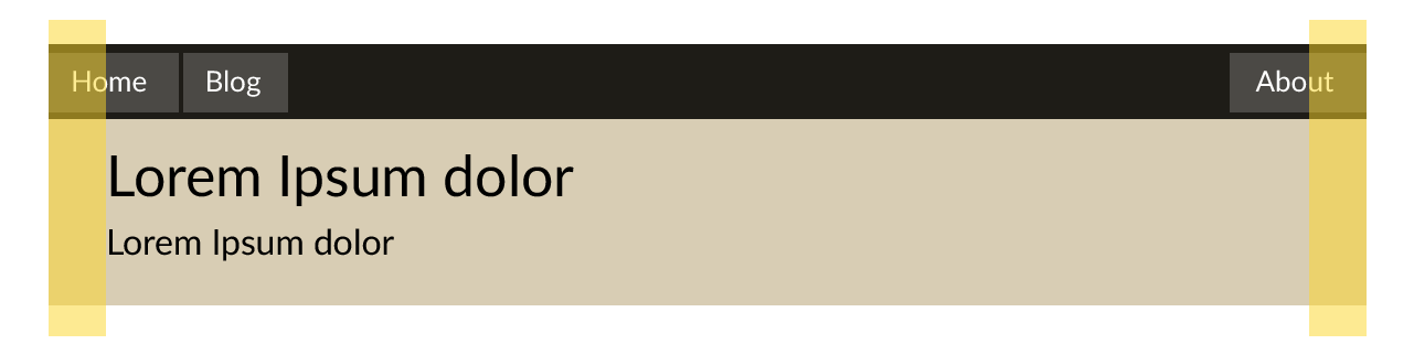
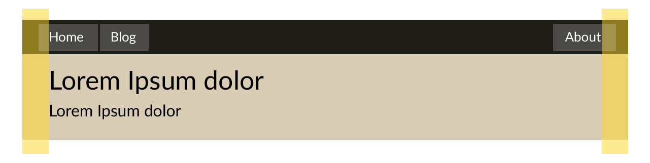
Navigation bars consist of three elements:

  1. The container (Your choice of element)
  2. The menu (nav)
  3. The menu items (ul li structure)

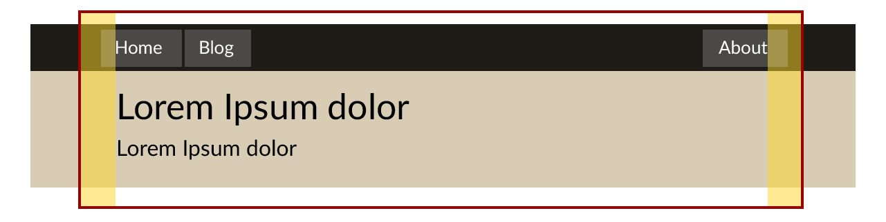
Why not just have <nav> without the extra div above? This is to give you more separation between the flexbox elements and the container it sits in. Flexbox display settings will affect the direct descendants. The need for this separation becomes clearer as the navbar becomes more complex, such as the addition of a wrapper inside the container.

<div class="navbar">
  <nav>
    <ul>
      <li>
        <a href="#">Home</a>
      </li>
      <li>
        <a href="#">Blog</a>
      </li>
    </ul>
    <ul>
      <li>
        <a href="#">Login</a>
      </li>
    </ul>
  </nav>
</div>

.navbar {
  @include navbar();
}

Primary and secondary menus

The first ul is automatically left aligned. Adding another will treat the second as a secondary menu and align it right. Adding more than two uls will simply continue to follow CSS flexbox rules.

<div class="navbar">
  <nav>
    <ul>
      <li>
        <a href="#">Left</a>
      </li>
    </ul>
  </nav>
</div>

<div class="navbar">
  <nav>
    <ul>
      <li>
        <a href="#">Left</a>
      </li>
    </ul>
    <ul>
      <li>
        <a href="#">Right</a>
      </li>
    </ul>
  </nav>
</div>

<div class="navbar">
  <nav>
    <ul>
      <li>
        <a href="#">Home</a>
      </li>
      <li>
        <a class="active" href="#">Blog</a>
      </li>
      <li>
        Archives
        <ul>
          ...
        </ul>
      </li>
    </ul>
  </nav>
</div>

<div class="navbar">
  <nav>
    <ul>
      <li>
        <a href="#">Home</a>
      </li>
      <li>
        <a href="#">Blog</a>
      </li>
      <li class="active">
        Archives
        <ul>
          ...
        </ul>
      </li>
    </ul>
  </nav>
</div>

Layout Styles

Navbars can have either default, fluid, or fluid-fixed layouts.

No style

By default, navbars have a layout parameter of "none" This is best for navigation bars that are in the page itself, and not integrated into the master layout of the page.

Navbar with layout of "none" (Default)

@include navbar();

<div class="navbar">
  ...
</div>

Fluid

You may want your navbar contents to be full width, but keep a healthy margin on the left and right. This is especially important on smaller screens.

Navbar with layout of "fluid" (Default)

Simply use the .fluid helper class to enable wrapping fluidly.

Simply pass in 'fluid' to the $layout parameter to enable a fluid wrapper.

<div class="navbar navbar-fluid">
  ...
</div>

@include navbar($layout: 'fluid');

Fluid-Fixed

Fluid fixed layouts allow your navbar's container to be as wide as you want, but still keep the contents in the same container as any other element using wrapper().

The underlying logic for this is more tricky than it appears, as the navbar will adjust itself in a way that the first and last menu items align, not by their edges, but the edges of the text inside them.

Navbar with layout of "fluid-fixed" (Default)

For a fluid-fixed layout, pass in 'fluid-fixed' to the $layout parameter.

For a fluid fixed layout, use the .navbar-fluid_fixed class.

@include navbar($layout: 'fluid-fixed');

<div class="navbar navbar-fluid_fixed">
  ...
</div>

Dropdowns

To create a dropdown, simply nest another ul in one of your lis.

Dropdowns require the data-ks-navbar attribute. Optionally, these can be instantiated manually via the k$.nav(el) function. el is the selector for the navbar container.

<div class="navbar" data-ks-navbar>
  <ul>
    <li>Options
      <ul>
        <li>
          <a href="#">Option1</a>
        </li>
        <li>
          <a href="#">Option2</a>
        </li>
        <li>
          <a href="#">Option3</a>
        </li>
      </ul>
    </li>
  </ul>
</div>

k$.navbar('.navbar')

Coloring navbar

Coloring the navbar just means changing the color of the container. However, darker colors might mean using lighter colors for the text for better contrast.

For this, pass in a color to the $background parameter of navbar()

navbar() will try to guess if the color is dark enough to warrant lighter text and automatically switch to white if so.

@include navbar($background-color: #333) 

For a darker navbar with lighter text, use .navbar-dark

<div class="navbar-dark">
  <nav>
    ...
  <nav>
</div>

Responsive

Collapse items

To use a collapse button on the navbar instead of flowing the menu items, you'll need to define a few settings.

First, tell the navbar that its items should collapse.

At this point, all lis except for .navbar-title will disappear. Be sure to add this, even if you only put the responsive button inside.

The = in the responsive button should automatically be changed to a three-bar icon.

.navbar.navbar-collapse {
  @include navbar($collapse: true);
}

<div class="navbar navbar-collapse" data-ks-navbar>
  <nav>
    <ul>
      <!-- This will be the title and
           the responsive collapse button -->
      <li class="navbar-title">
        <h1>Acme Corp</h1>
        <button role="button">=</button>
      </li>

      <!-- These are the collapsed navigation
           items. -->

      <li>
        <a href="/products/">Products</a>
      </li>
      <li>
        <a href="/blog/">Blog</a>
      </li>
    </ul>
  </nav>
<div>

Define a breakpoint (optional)

By default, the navbar will collapse menu items at screen sizes narrower than a tablet (according to the width defined as $tablet). To customize this, you can change the $breakpoint.

The $breakpoint is simply the screen width at which responsive styling should cease to be applied. In the above example, we use one of the provided screen size variables. However, you may also pass in a css measurement value.

Available screen size variables:

  • $phone
  • $phablet
  • $tablet
  • $desktop
  • $large-monitor
  • $xl-monitor

.navbar {
  @include navbar($breakpoint: $tablet, $collapse: true);
}

@include navbar($breakpoint: 768px, $collapse: true);
@include navbar($breakpoint: 200em, $collapse: true);
@include navbar($breakpoint: 500pt, $collapse: true);

Fixed navbar

To create a fixed navbar, pass in true to the $fixed parameter of navbar().

To create a fixed navbar, use the .navbar-fixed class.

By default, this sticks the navbar to the left and right Be sure to specify these in your CSS if needed, especially if using stacked navbars.

You'll also need to decide on the padding you'll need on the underlying page. Positioning the navbar to fixed will cause the content to start underneath it. Consider adding a margin-top that is equal to the height of the navbar.

Keep in mind, the navbar's height changes just slightly, due to the responsive text inside of it, so it's best to test this value on mobile.

<div class="navbar navbar-fixed">
  <nav>
    <ul>
      ...
    </ul>
  </nav>
</div>

.page {
  margin-top: 45px;
}

.navbar.navbar-fixed {
  @include navbar($fixed: true);
}

To apply a fixed navbar one-off, use the navbar-fixed mixin.

.navbar1, .navbar2 {
  @include navbar();
}

.navbar1 {
  @include navbar-fixed();
}

Stacking navbars

For best performance with spacing and z-indexes, I highly recommend instead using a single div to contain your two non-fixed navbars.

<div class="navbars">
  <div class="navbar navbar-1">...</div>
  <div class="navbar navbar-2">...</div>
</div>

.navbars {
  position: fixed;
  z-index: 1000;
  top: 0;
  left: 0;
  right: 0;
}

Pagination

Pagination styling is very similar to the navigation bar. As such, the markup is also very similar and a .pagination-dark class is available. a $background-color can be passed in to pagination().

<div class="pagination">
  <ul>
    <li>
      <a href="#">&laquo; Prev</a>
    </li>
    <li>
      <a href="#">Next &raquo;</a>
    </li>
  </ul>
</div>

<!-- laquo/raquo stand for "left and right angle quotes" -->

.pagination {
  @include pagination();
}

Showing pages

Multiple items in a ul will group much like a button group.

<div class="pagination">
  <ul>
    <li>
      <a href="#">1</a>
    </li>
    <li>
      <a href="#">2</a>
    </li>
    <li>
      <a href="#">3</a>
    </li>
    <li>
      <a href="#">4</a>
    </li>
    <li>
      <a href="#">5</a>
    </li>
  </ul>
</div>

<div class="pagination">
  <ul>
    <li>
      <a href="#">&laquo; Prev</a>
    </li>
  </ul>

  <ul>
    <li>
      <a href="#">1</a>
    </li>
    <li>
      <a href="#">2</a>
    </li>
    <li>
      <a href="#">3</a>
    </li>
    <li>
      <a href="#">4</a>
    </li>
    <li>
      <a href="#">5</a>
    </li>
  </ul>

  <ul>
    <li>
      <a href="#">Next &raquo;</a>
    </li>
  </ul>
</div>

Other options

Adding the disabled attribute will signal to the user the option is not available.

<div class="pagination">
  <ul>
    <li>
      <a href="#">1</a>
    </li>
    <li>
      <a href="#" disabled>2</a>
    </li>
  </ul>
</div>